Income, obesity, and nutrition
The relationship between income, obesity, and nutrition in US Households - an exploratory data analysis exercise
Introduction
Obesity is a problem in America. More than two-thirds (68.8 percent) of adults are considered to be overweight or obese. While all segments of the U.S. population are affected by obesity, obesity tends to be particularly prevalent in low-income households. There are many factors that contribute to obesity in low income homes including:
- Limited resources and lack of access to healthy, affordable foods.
- Cycles of Food Deprivation and Overeating.
- Fewer Opportunities for Physical Activity.
- Greater Exposure to Marketing of Obesity-Promoting Products.
- Limited Access to Health Care
In the report that follows, I will only observe one of these relationships: resources and access to healthy foods. To do this, I will observe the relationships between income, BMI (body mass index), and the diets of 6,000+ participants in the NHANES study. I hypothesize a negative relationship between income and the daily intake of calories, carbs, fat, protein, and sugar - so as income rises, consumption on these metrics falls.
About the data:
The National Health and Nutrition Examination Survey (NHANES) is a survey research program conducted by the National Center for Health Statistics (NCHS) to assess the health and nutritional status of adults and children in the United States, and to track changes over time. The NHANES interview includes demographic, socioeconomic, dietary, and health-related questions. The examination component consists of medical, dental, and physiological measurements, as well as laboratory tests administered by medical personnel.
The relationship between Income and Obesity:
As a first step, I’d like to look at the relationship between income and obesity. For this, I am going to use BMI data from the body measurements dataset and join that with our demographic data which contains income to poverty ratios.
Income to poverty ratios are provided to us by the NHANES dataset. NHANES calculates this ratio by dividing family (or individual) income by the poverty guidelines specific to the survey year. For 2011, the poverty line for a family of 3 was $18.5k. Values at or above 5.00 were coded as 5.00 because of disclosure concerns. The values were not computed if the income data was missing and was also therefore dropped from this analysis.
Income vs. BMI Scatter plot
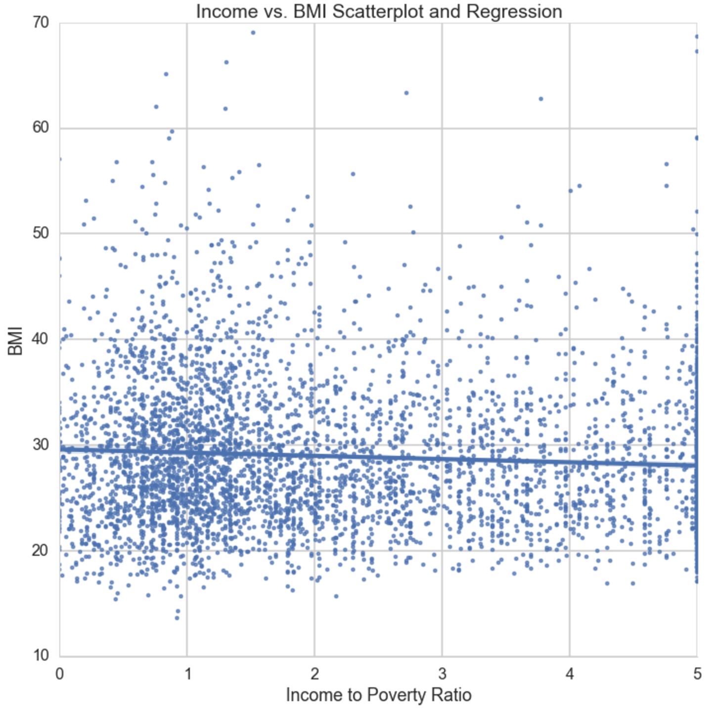
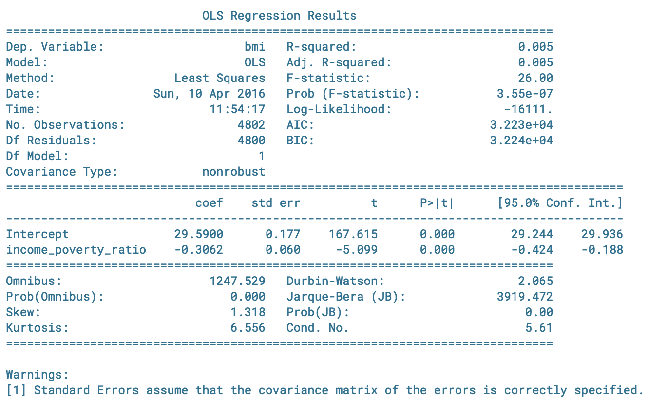
This OLS regression is inline with my original hypothesis that stated there is a negative relationship between BMI and Income. We see as income:poverty increases by a point (or 18.5k for a family of 3), BMI decreases at a rate of -0.3.
Income vs. Calories
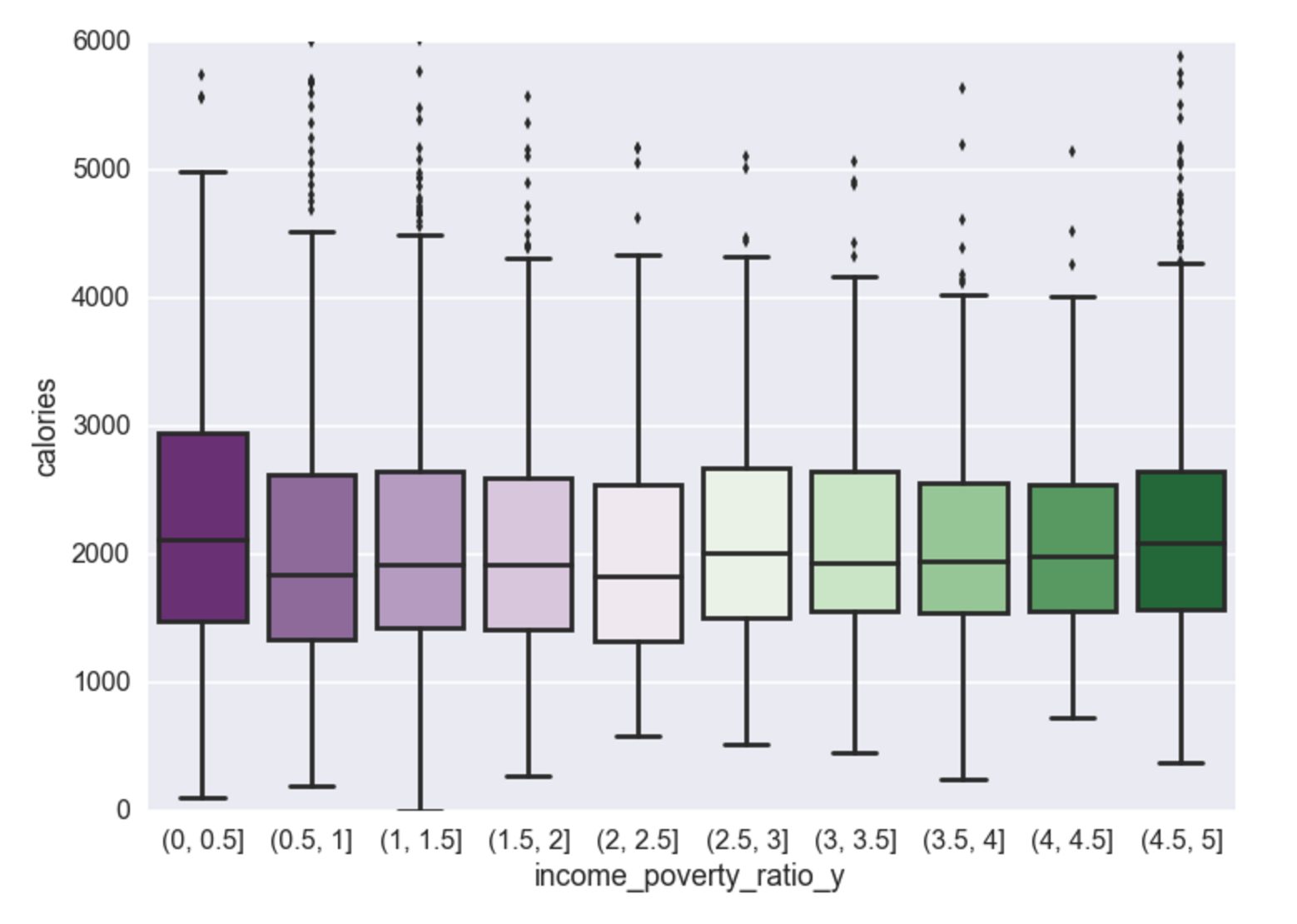
In the lowest income group you see a higher mean in calorie consumption than the rest of the population. As income increases, a negative relationship still exists, however the delta in 0-0.5 (lowest) to 0.5-1 (2nd to lowest) has the largest negative relationship than the delta between any other segment.
Income vs. Carbs
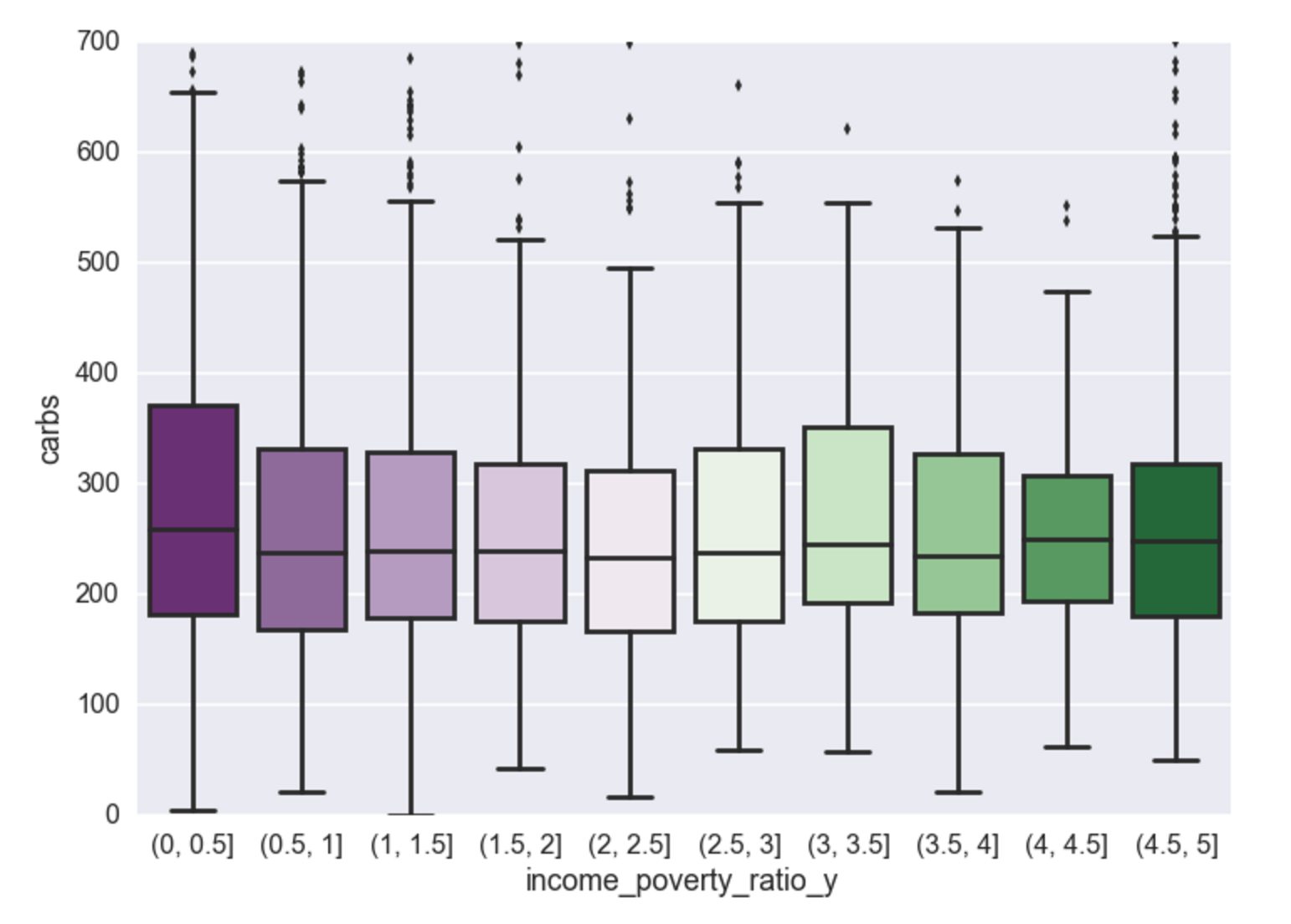
This same relationship (as above) exists for carbs. This is because carbs contribute to the calorie difference.
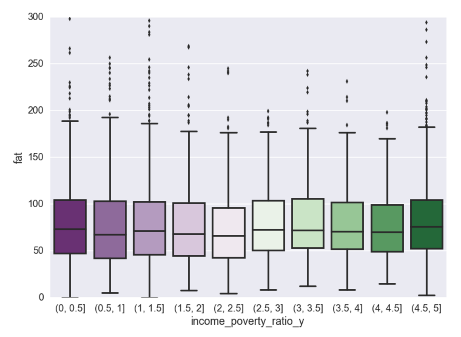
Income vs. Fat
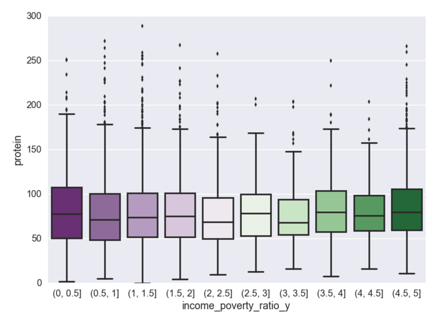
Income vs. Protein
Income vs. Sugar
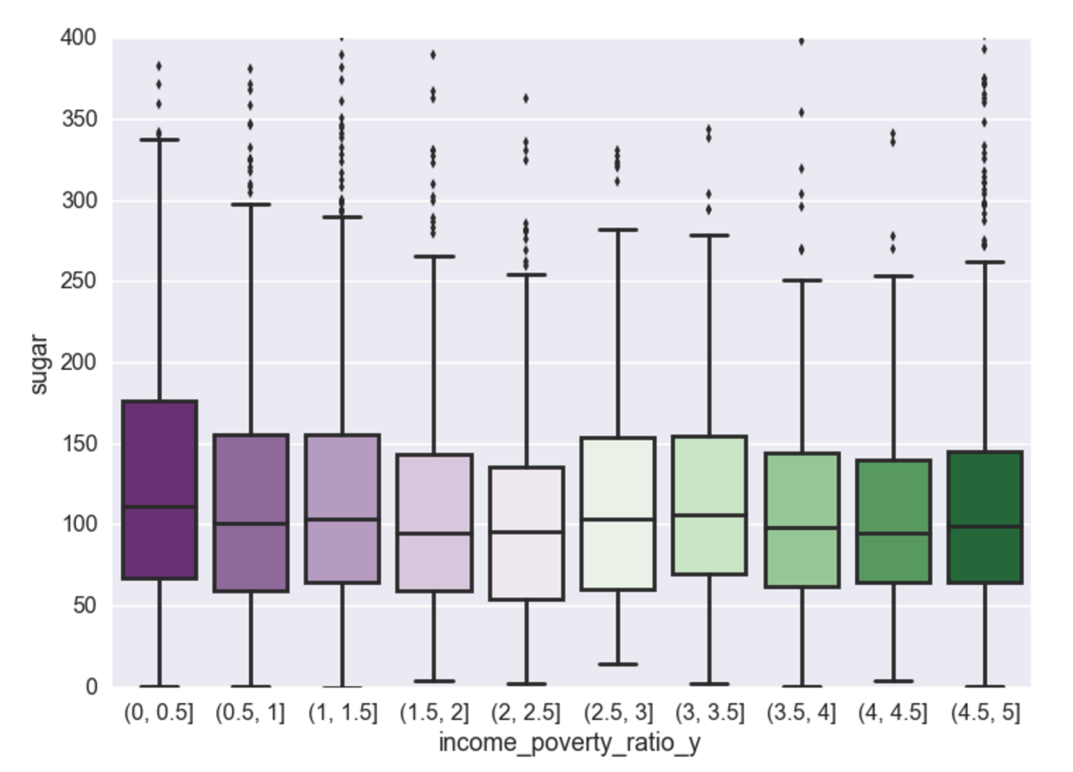
Calories, carbs, and sugar - there exists a negative relationship between poverty to income ratio and consumption of these food dimensions. Cheap high fructose corn syrup to be the cause? Perhaps, but that will have to wait for another analysis for food composition. Interestingly, the analysis shows that once someone reaches an income to poverty ratio of ~2.5, this negative relationship no longer exists and then for every increase in income there is very little effect on the makeup of their food consumption. Unsurprisingly, it appears the negative relationship is most pronounced for sugar (and carbs, which contain sugar, and calories which contain carbs).
Where’s all the sugar coming from?
The graph’s below represent a split group comparison of the top 25% and bottom 25% of individuals on the income/poverty scale. The two graphs below represent a difference of mean consumption for each food dimension.
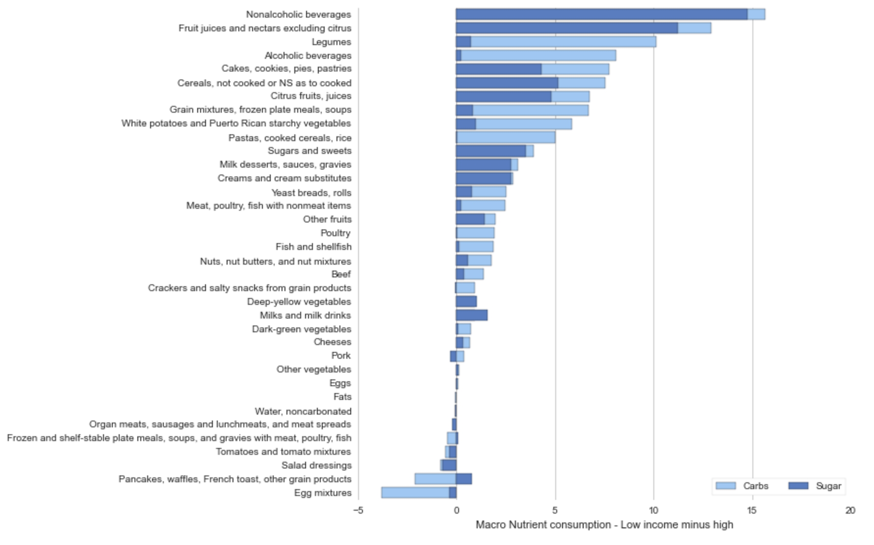
The graph below shows that on average lower income individuals consume ~ 15g (more than high income individuals) of carbs and sugar per day of non-alcoholic beverages, fruit juices, and cereals.
Income: Sugar and Carbs
Income: Calories
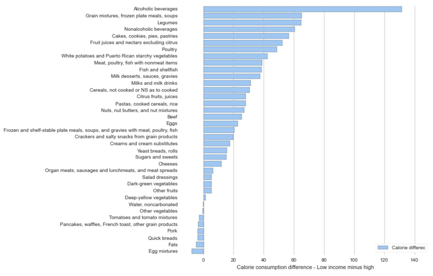
It’s interesting to know that non-alcoholic and alcoholic beverages are responsible for the biggest mean difference between high income and low income consumption. Below let’s look at BMI to see if there is a similar relationship between high BMI and the population.
It’s also interesting to find that lower income individuals are consuming more than those of higher income on nearly every food dimension. I wonder about the science behind the cost of food, does cheaper food = higher calorie food?
BMI
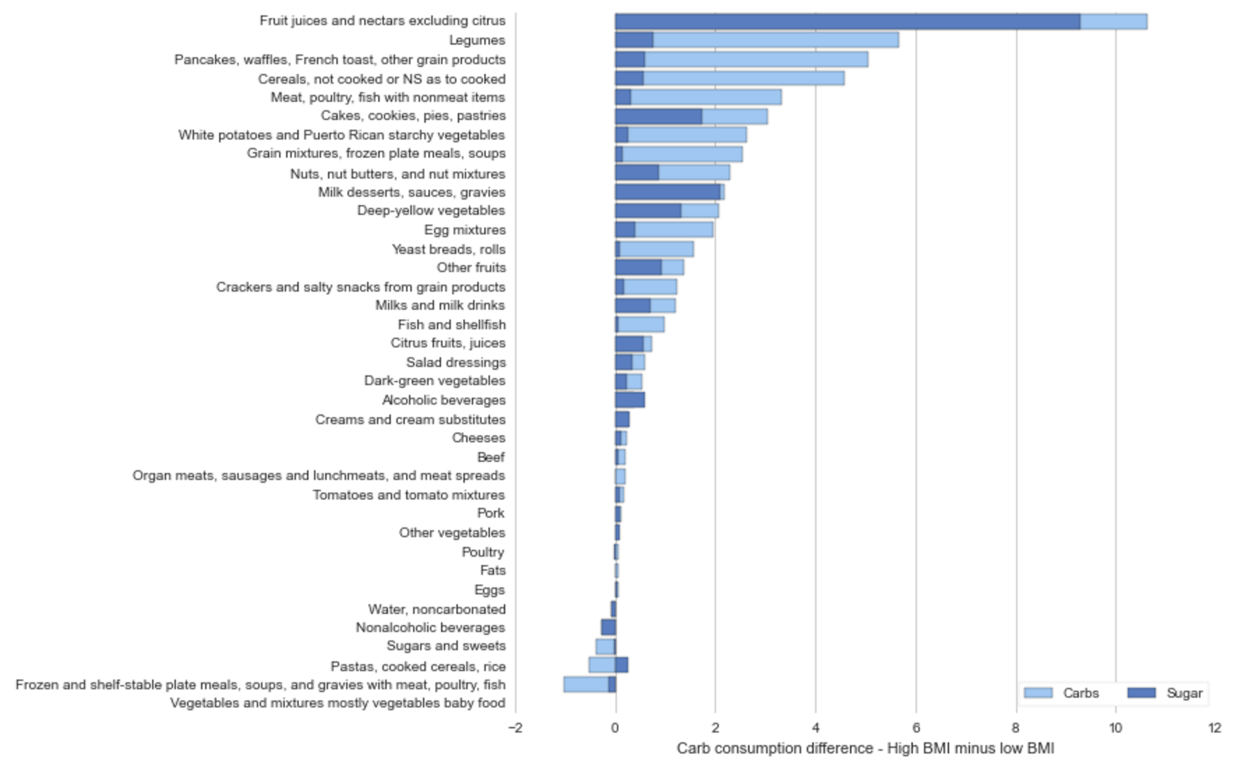
The two graphs below compare the mean food consumption differences between the upper BMI quartile and the entire population for both carbs, sugar, and calories.
Upper 25% BMI less sample mean BMI: Sugar and Carbs
Upper 25% BMI less sample mean BMI: Calories
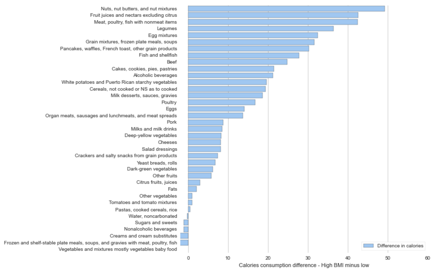
The most obvious take-away from a comparison of the previous four graphs is the contribution that alcohol and non-alcoholic beverage consumption (soda) contribute to lower income consumption.
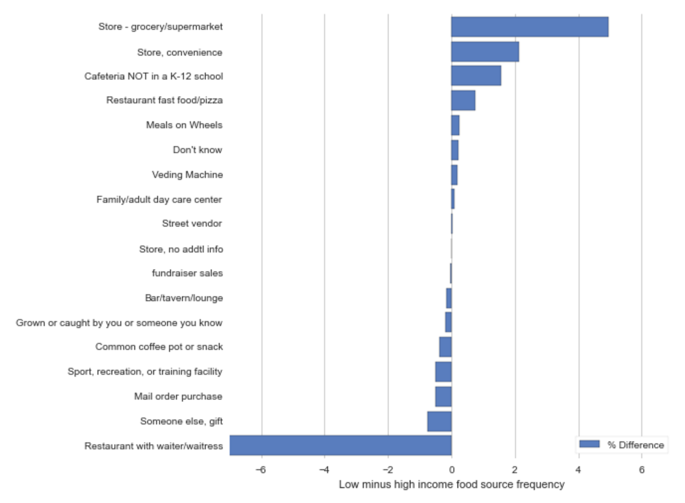
Where’s the food coming from?
For every food record in the NHANES database, there is a field called ‘source’ which represents the origin of the food. The graph above is computed by taking the top 25% and bottom 25% of individuals on the income/poverty scale and calculating the percentace of each ‘source’ of food record. For example, the top bar represents that low income people eat food from the grocery store ~5% more often than those of high income.
Above, we see that low income individuals are more likely to get their food from the grocery store (red) and the convenience store (green), where those of higher income eat at restaurants more frequently (blue).