Obesity is a problem in America. More than two-thirds (68.8 percent) of adults are considered to be overweight or obese. While all segments of the U.S. population are affected by obesity, obesity tends to be particularly prevalent in low-income households. There are many factors that contribute to obesity in low income homes including:
Limited resources and lack of access to healthy, affordable foods.
Cycles of Food Deprivation and Overeating.
Fewer Opportunities for Physical Activity.
Greater Exposure to Marketing of Obesity-Promoting Products.
Limited Access to Health Care
In the report that follows, I will only observe one of these relationships: resources and access to healthy foods. To do this, I will observe the relationships between income, BMI (body mass index), and the diets of 6,000+ participants in the NHANES study. I hypothesize a negative relationship between income and the daily intake of calories, carbs, fat, protein, and sugar - so as income rises, consumption on these metrics falls.
About the data:
The National Health and Nutrition Examination Survey (NHANES) is a survey research program conducted by the National Center for Health Statistics (NCHS) to assess the health and nutritional status of adults and children in the United States, and to track changes over time. The NHANES interview includes demographic, socioeconomic, dietary, and health-related questions. The examination component consists of medical, dental, and physiological measurements, as well as laboratory tests administered by medical personnel.
The relationship between Income and Obesity:
As a first step, I’d like to look at the relationship between income and obesity. For this, I am going to use BMI data from the body measurements dataset and join that with our demographic data which contains income to poverty ratios.
Income to poverty ratios are provided to us by the NHANES dataset. NHANES calculates this ratio by dividing family (or individual) income by the poverty guidelines specific to the survey year. For 2011, the poverty line for a family of 3 was $18.5k. Values at or above 5.00 were coded as 5.00 because of disclosure concerns. The values were not computed if the income data was missing and was also therefore dropped from this analysis.
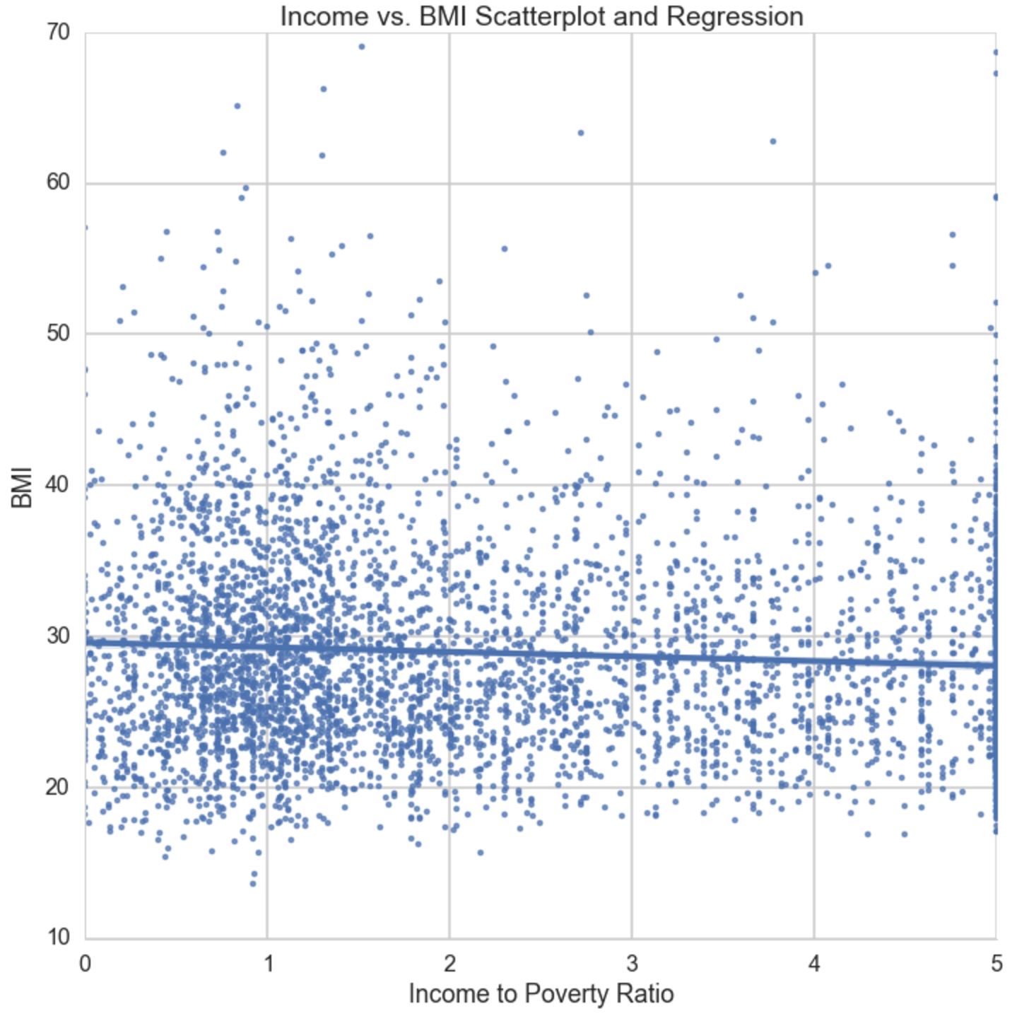
Income vs. BMI Scatter plot
This OLS regression is inline with my original hypothesis that stated there is a negative relationship between BMI and Income. We see as income:poverty increases by a point (or 18.5k for a family of 3), BMI decreases at a rate of -0.3.
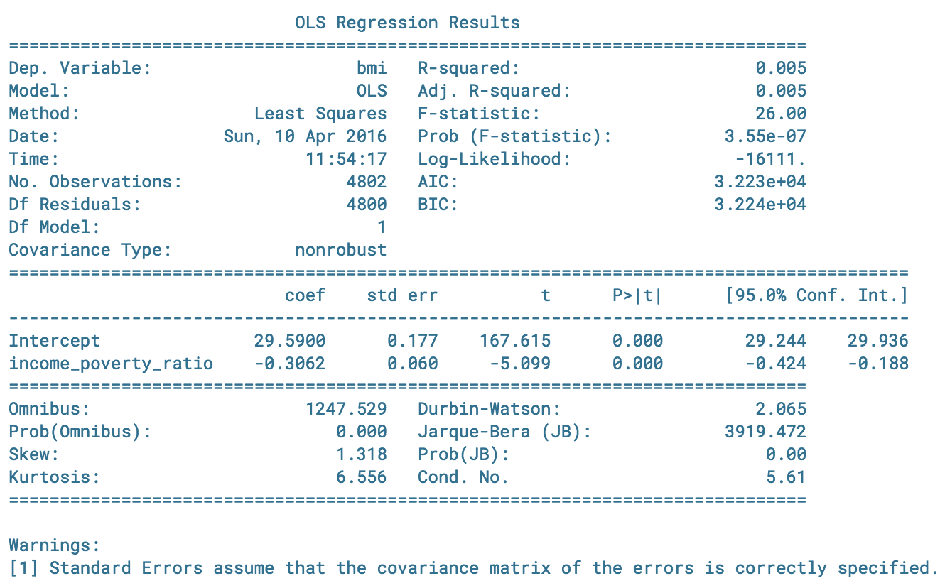
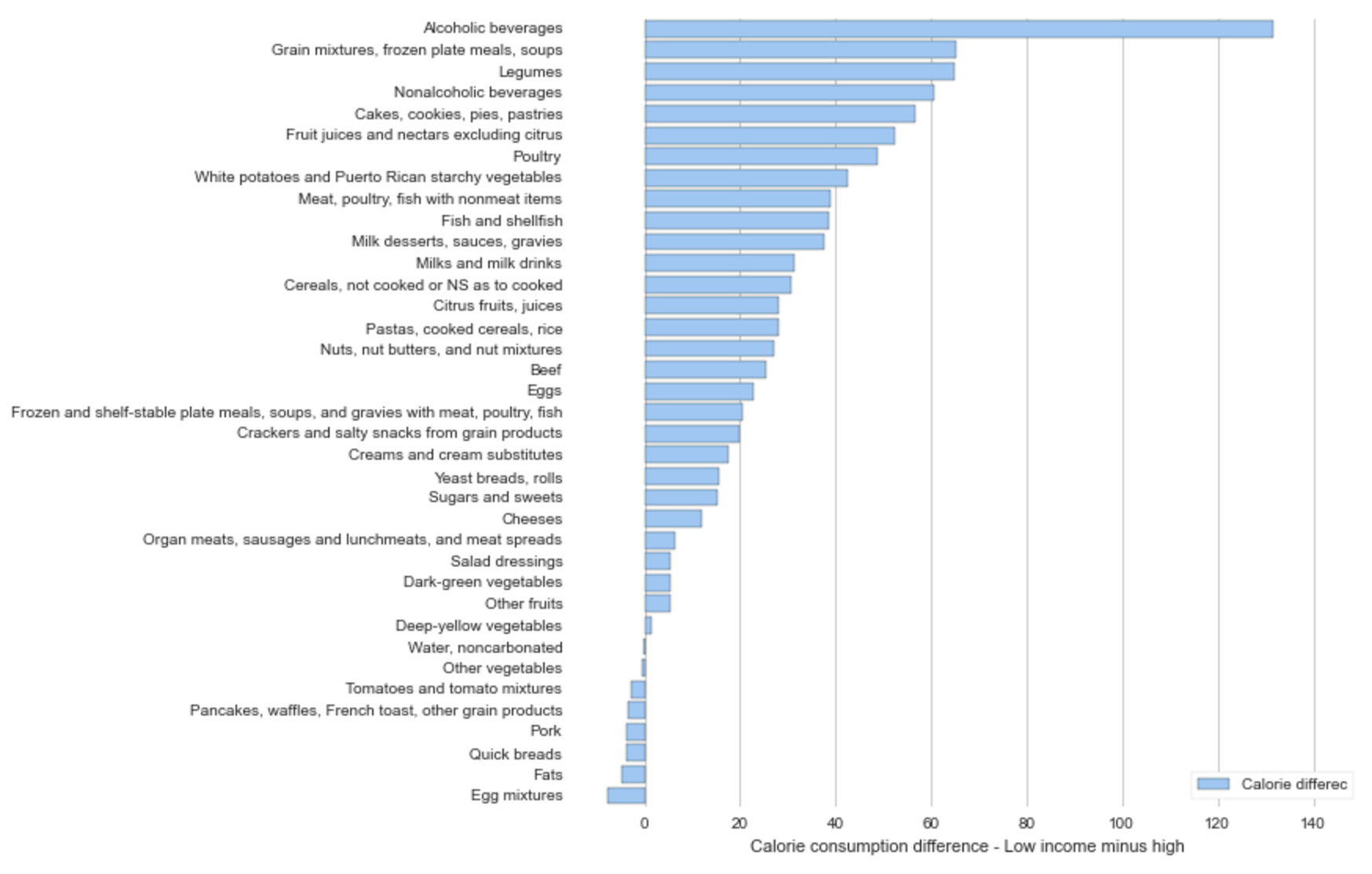
Income vs. Calories
In the lowest income group you see a higher mean in calorie consumption than the rest of the population. As income increases, a negative relationship still exists, however the delta in 0-0.5 (lowest) to 0.5-1 (2nd to lowest) has the largest negative relationship than the delta between any other segment.
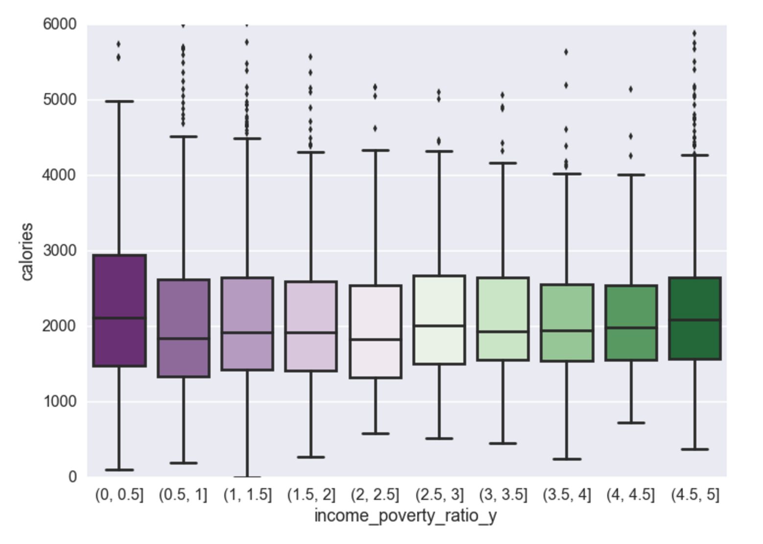
Income vs. Carbs
This same relationship (as above) exists for carbs. This is because carbs contribute to the calorie difference.
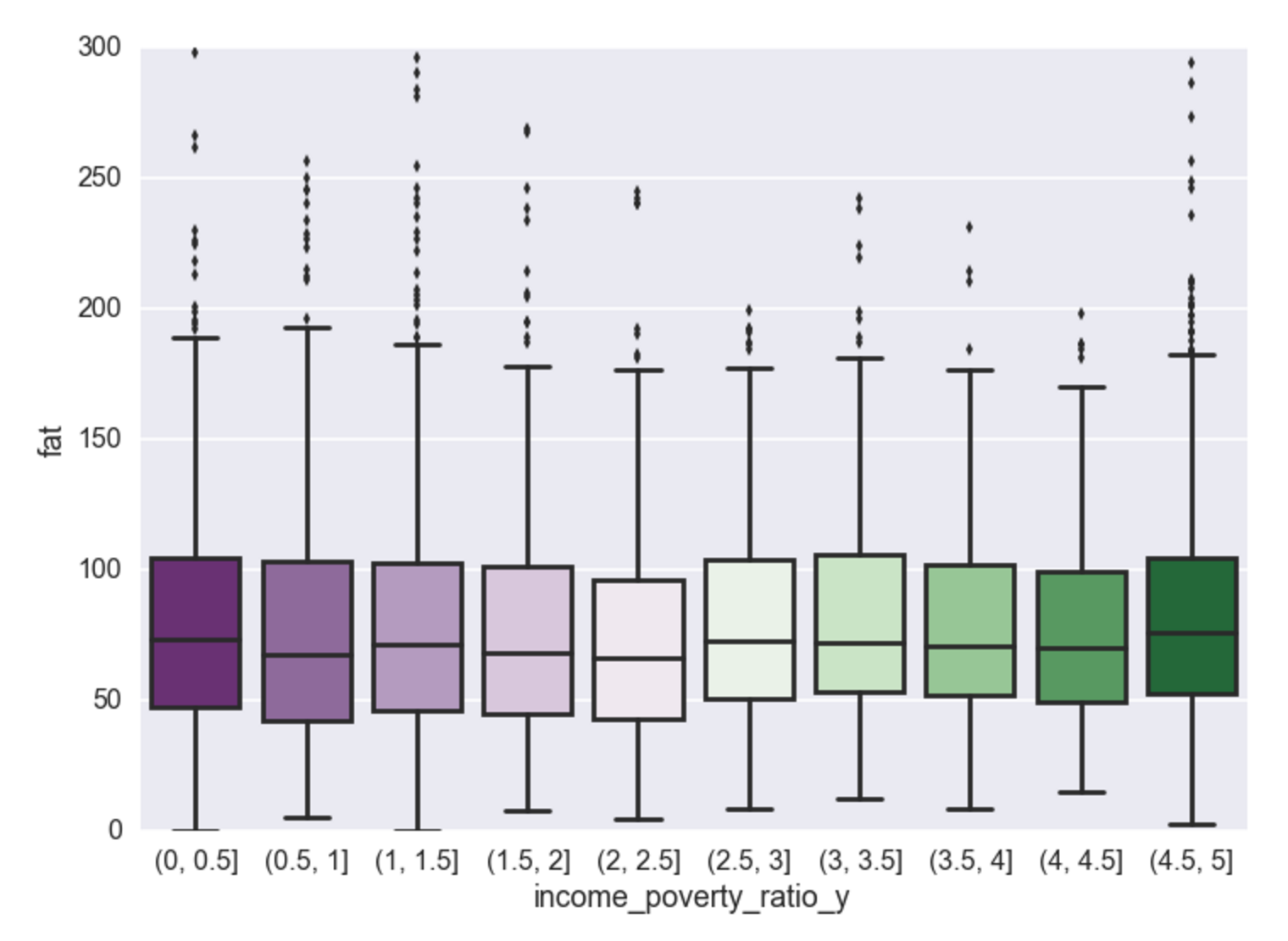
Income vs. Fat
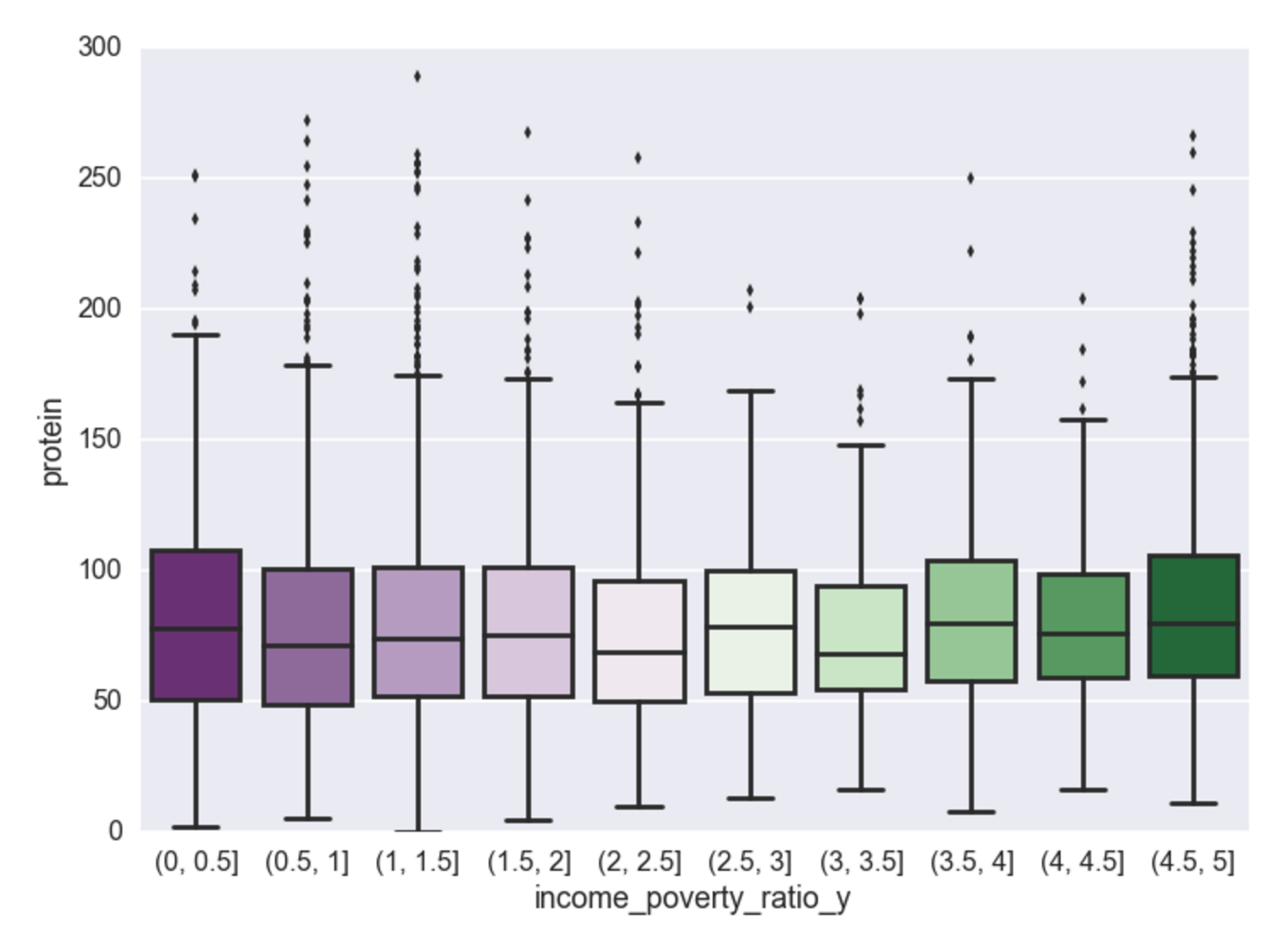
Income vs. Protein
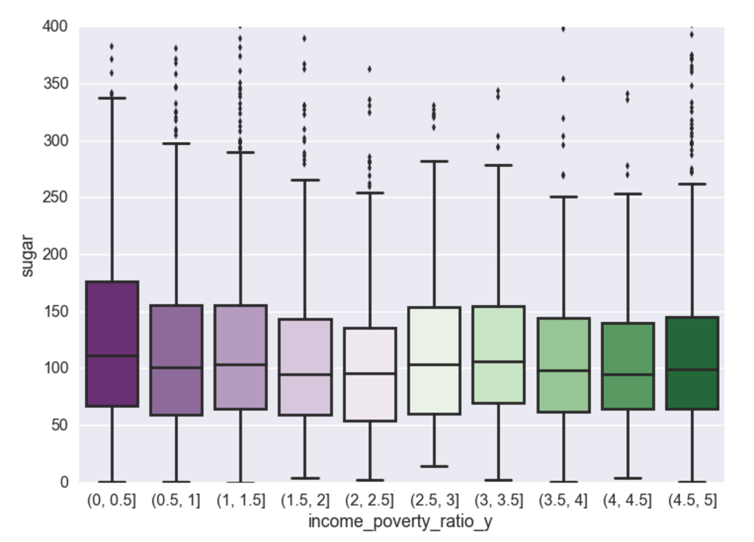
Income vs. Sugar
Calories, carbs, and sugar - there exists a negative relationship between poverty to income ratio and consumption of these food dimensions. Cheap high fructose corn syrup to be the cause? Perhaps, but that will have to wait for another analysis for food composition. Interestingly, the analysis shows that once someone reaches an income to poverty ratio of ~2.5, this negative relationship no longer exists and then for every increase in income there is very little effect on the makeup of their food consumption. Unsurprisingly, it appears the negative relationship is most pronounced for sugar (and carbs, which contain sugar, and calories which contain carbs).
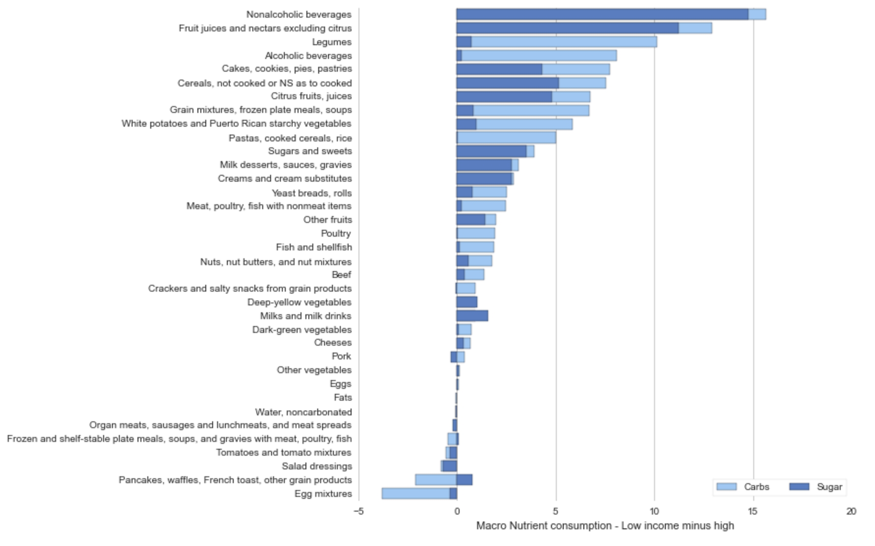
Where’s all the sugar coming from?
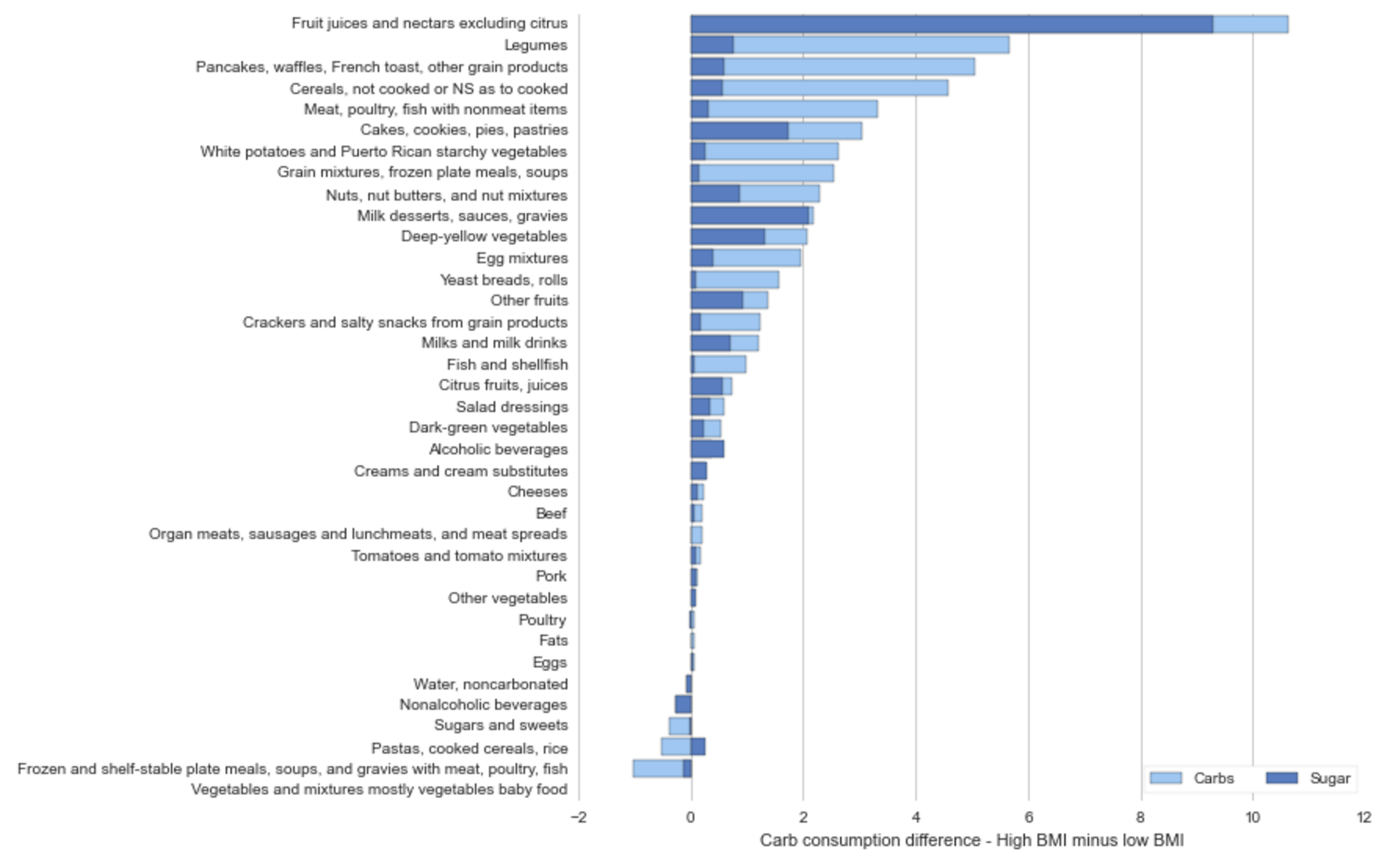
The graph’s below represent a split group comparison of the top 25% and bottom 25% of individuals on the income/poverty scale. The two graphs below represent a difference of mean consumption for each food dimension.
The graph below shows that on average lower income individuals consume ~ 15g (more than high income individuals) of carbs and sugar per day of non-alcoholic beverages, fruit juices, and cereals.
Income: Sugar and Carbs
Income: Calories
It’s interesting to know that non-alcoholic and alcoholic beverages are responsible for the biggest mean difference between high income and low income consumption. Below let’s look at BMI to see if there is a similar relationship between high BMI and the population.
It’s also interesting to find that lower income individuals are consuming more than those of higher income on nearly every food dimension. I wonder about the science behind the cost of food, does cheaper food = higher calorie food?
BMI
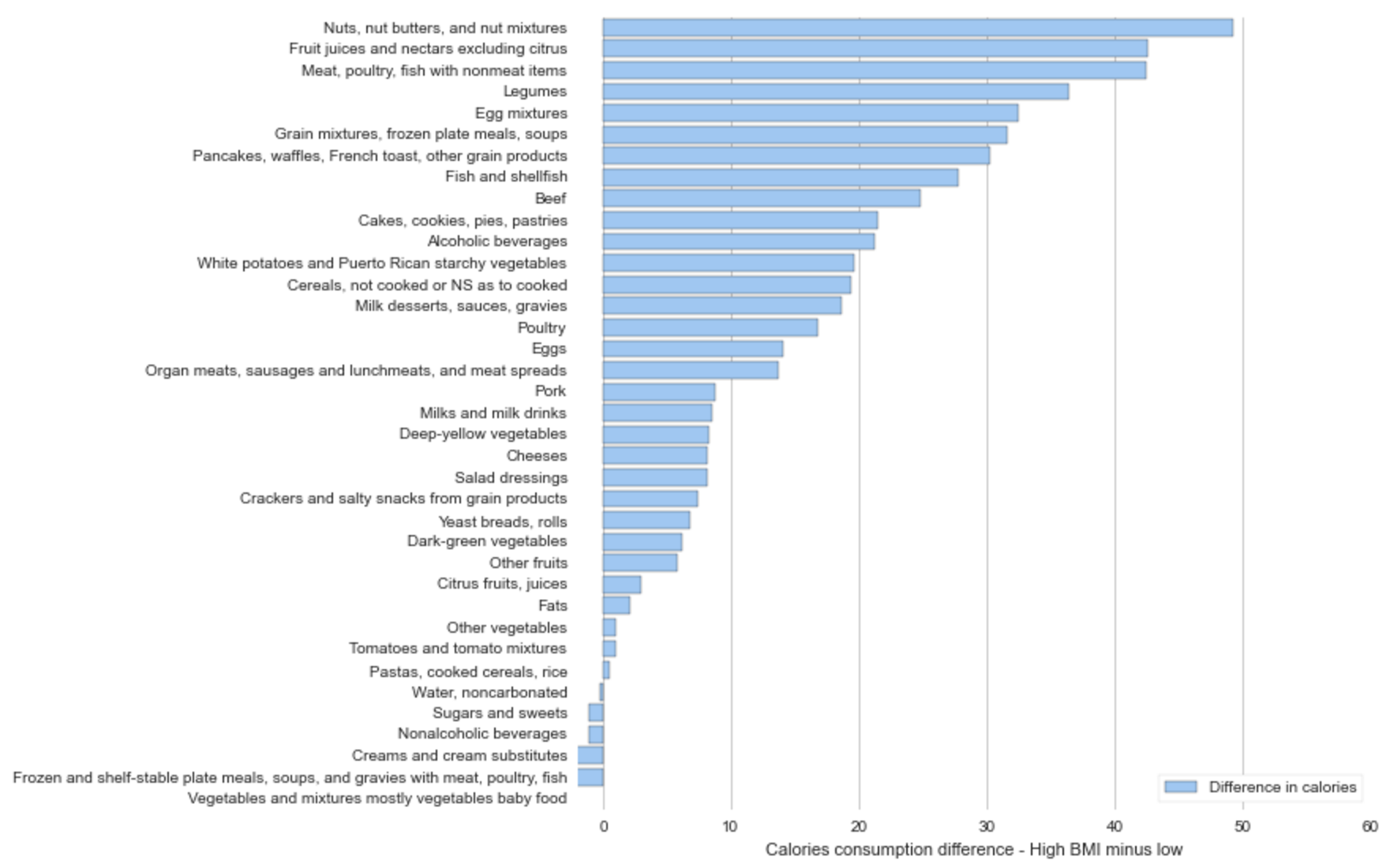
The two graphs below compare the mean food consumption differences between the upper BMI quartile and the entire population for both carbs, sugar, and calories.
Upper 25% BMI less sample mean BMI: Sugar and Carbs
Upper 25% BMI less sample mean BMI: Calories
The most obvious take-away from a comparison of the previous four graphs is the contribution that alcohol and non-alcoholic beverage consumption (soda) contribute to lower income consumption.
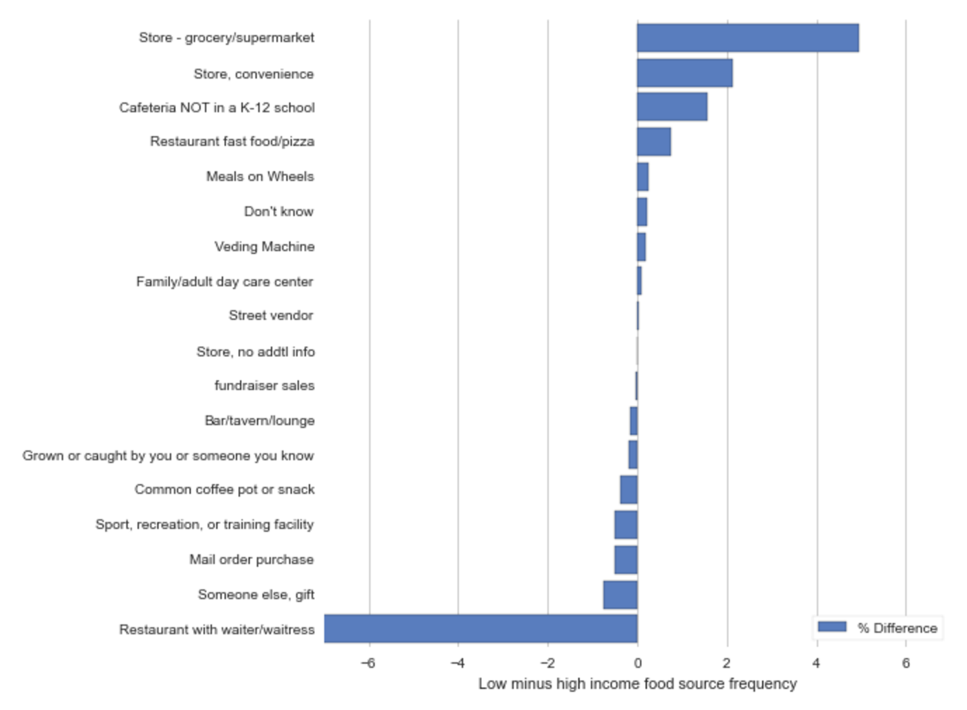
Where’s the food coming from?
For every food record in the NHANES database, there is a field called ‘source’ which represents the origin of the food. The graph above is computed by taking the top 25% and bottom 25% of individuals on the income/poverty scale and calculating the percentace of each ‘source’ of food record. For example, the top bar represents that low income people eat food from the grocery store ~5% more often than those of high income.
Above, we see that low income individuals are more likely to get their food from the grocery store (red) and the convenience store (green), where those of higher income eat at restaurants more frequently (blue).
Registered business locations in San Francisco maintained by the Office of Treasurer-Tax Collector, including business locations that have been sold, closed, or moved out of San Francisco. A link to the dataset is here.
Below is a very simple Choropleth visualization of the number of business in the dataset per zipcode. It does not isolate for sold/closed/or moved. That would be a useful extension. It was created using CartoDB. IPython notebook to organize data is here.
The Existing Commercial Buildings Energy Performance Ordinance (Environment Code Chapter 20) requires that each non-residential building with at least 10,000 square feet of conditioned (heated or cooled) space must be benchmarked using Energy Star Portfolio Manager annually, and undergo an energy audit or retrocommissioning at least once every 5 years. A link to the dataset is here.
Below is a very simple Choropleth visualization of the mean 2014 Energy Star Score for each zipcode in San Francisco. It was created using CartoDB. IPython notebook to organize data is here.
First, let’s explore an example to get a sense of what is cognitive ease. Consider the two sentences below, which statement is true?
Brad Pitt was born in 1962.
Benjamin Bernanke was born in 1954.
Experiments similar to this have shown that the first statement is more likely to be believed to be true. Why? Brad Pitt, the personality, is on average more familiar to people than Benjamin Bernanke, his name is easier to pronounce, and the sentence is more legible (it’s bolded). Because of these features, when you read the first sentence you feel a greater sense of ‘cognitive ease’ compared to when you read the second. This example is adapted from the book Thinking Fast and Slow by Daniel Khaneman. And, in fact, both statements are false.
Cognitive ease is a state of mind that is experienced when things are going well, there are no threats, and nothing requires additional attention. On the flipside, cognitive strain is experienced when you have to call upon additional mental resources for unmet demands (think of walking into an unfamiliar grocery store for the first time, where’s the pasta?). You’re constantly switching between cognitive ease and strain throughout the course of the day as you switch from routine to novel experiences. The brain actively seeks routine to preserve it’s mental resources and experiences positive affect when familiar experiences are found.
####Who is Max Martin and what does he have to do with this?
Max Martin is arguably the most influential music producer of modern day. He’s written and co-written 21 number-one hits for artists like Taylor Swift, Katy Perry, N’Sync, The Backstreet Boys and many others. Martin is from Sweden, has ‘disciples’ who are just as influential as he is, he’s basically a musical god.
In music too, our brains are designed to seek out patterns and have a preference for familiarity. “We work melody first. That’s Max Martin’s school. We’ll spend days, sometimes weeks, challenging the melody. The goal is to make it sound like anyone can do this, but it’s actually very difficult. [Martin taught me that] Instead of making tracks for five thousand people, why not make tracks for a million?” says Savan Kotecha, one of Martin’s apprentices.
Funny enough, Max Martin is actually not his real name, it’s Martin Karl Sandberg. Unsurprisingly, I suspect he changed his name to make himself appear more familiar and likeable - ‘Max Martin’ comes off the tongue nicely, and I swear I knew a Max Martin in high school.
####So what do Max Martin and Starbucks have in common?
There are scholarly articles written about Starbucks and their brand/product experience, so I won’t delve into it here. Martin and Starbucks both create positive user experiences by consistently delivering familiar experiences. Martin seeks out melodies that are simple, easily understood, and breed familiarity with existing popular music. Starbucks has over 11,000 locations in the US, all of which feature the same interior design patterns and deliver the same coffee cup time and time again.
####How does this apply to design?
Our brains are lazy, they follow the path of least resistance and actually experience stress when called upon to do something not intuitive - i.e. double digit multiplication, doing something new for the first time, or simply when called upon to react in an unfamiliar situation. As a designer, it is your goal to design a product that is easy and intuitive to use. One way to inform your design is to understand aspects to your product or UI or service that your user is likely to already be familiar with and use those in your design. This is most applicable when tying to design the layout of controls or displays. The relationship between the controls, and what they’re supposed to do, is called their mappings. Imagine how painful it would be to type on a keyboard with different key locations. For a more detailed dive into this aspect of design, see The Design of Everyday Things by Don Norman.
For too long I have delayed the process of constructing thoughtful commentary for others to read via a blog. In college I created a Tumblr named something like the “Irrationality of Happiness” (does that even make sense?) because I drank wayyy to much caffeine when writing my psychology thesis and needed an avenue to express what felt like the ability to read minds. I wrote one post which I can’t even find anymore. Why didn’t I continue? I had just landed a job and thought more harm than good would come from blogging about my ideas. We’re not even talking about radical ideas - it just felt that anything not directly constructive for the job created unnecessary exposure. Psychology can be pretty provocative.
The next urge I had to blog was a couple years into my first job and I wanted to change careers. I wanted to blog in order to convince others that that although I have zero work experience in startups or technology I am capable of much more and they should hire me. After nearly a month of drafting, I realized I was writing original ‘fluff’ and regurgitating opinions to decorate my online presence. Although in theory I agreed with the “lean startup” methodology and had adopted technology market opinions - I still thought that HTML was a programming language and in fact had zero practical experience. My mind hadn’t spent nearly enough time thinking about entrepreneurship - at that point blogging just didn’t feel right.
Blogging is difficult. Speaking to a potentially unlimited audience (because that is the point of these things, right?) is frightening. What if I say things that people don’t like? What if I missed something in my research? What if I’m just restating something others have already nailed home? Well… I guess you have to anticipate that those thing are probably going to happen, and embrace them. What’s different this time? I’ve realized, I only stand to benefit should I communicate my ideas. I think if you blog with the intent to provide value to others, you stand to gain a lot from the conversation that follows.
I’ve always wanted to “map my mind” to see if the exercise gives me any insight into my ideas, thoughts, or interests. Individually, mind mapping is a useful exercise, but collectively through a blog - I think you stand to gain much more. Ideas are meant to be shared, they’re contagious by design, some become viral - if you think your ideas are interesting and others may find them useful - let it rip. You’ll never know what happens if you don’t :).